Multimedia Embroidery Art Tips to Create this Black Butler Embroidery Frame
Black Butler Embroidery in Frame
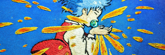
Ciel Phantomhive
Watercolor, Prisma Colored Pencils and Dual Brush Pens

Creating the Outline

Outline/Tracing

I searched up official art from Yana Toboso, then picked my favorite image and edited on Picsart to add clarity to the outlines to better trace. After printing, I taped the original image to a sheet of carbon paper to begin tracing onto the fabric, I personally like the carbon paper method since fabric solvy tends to stiffen my stitches.
(I'll be making a blog about stiff thread to soft thread after washing fabric solvy!)
I used a stemmed stitch to create the outline, using only one strand of DMC thread, also going back to thicken some lines, again with one strand only. I also double my cotton fabric when using black thread and I usually jump around from different spaces when working, this helps me hide those lines when I decide to close my artwork.
Watercolor

Watercolors used:
Windsor & Newton - Cotman watercolor
- Indian Red
- Alizarin Crimson Hue (absolute favorite! Such a nice rose pink/red color)
- Raw Sienna
- Rose Madder Alizarin
Royal Langnickel
Bloopers!
 Too much bleeding?
In this small mistake, I let my fabric soak up too much water when water coloring onto the rose. I assumed it was dry enough to add the black and unfortunately the back paint bled to the point where I couldn't avoid or fix it, even when trying to blow dry it so I can stop it from bleeding it still was too late but it did help it prevent from bleeding into the areas I didn't want it to.
Once it dried completely I did try to salvage it by using a clorox wipe to try and fade the black a little around the area, it didn't make it disappear completely but it did help to kind of lighten that area.
I highly suggest working in-between colors when water coloring onto the fabric, when water coloring onto the fabric it is typically the same when water coloring onto paper.
Let your paint dry and the water dry before applying more color or a different color, a hack to make this process a lot faster I recommend using a hair dryer, that's right! A blow dryer helps make things quicker, use it in a cool setting to avoid those paint stains and try not to overwork your area of paint.
Also I wouldn't use this tip if you're trying to make your watercolor paint a lot softer than intended, using this method lets you darken some areas, like shadowing or giving a darker gradient effect and you can't go back from that.
Prisma Color Pencil Fill

Since Prisma Color pencils are acknowledged for their effortless blending I hoped this would be a great way to composite a hair coloring effect I am trying to do. Since I am not skilled or too comfortable using watercolor, I settled on using color pencils to fill in the facial area and hair. Also going back to darken some areas to add a more intricate form of shading that I felt watercolor couldn't achieve for this piece.
Embroidering and Framing

The only area I embroidered with DMC thread color is the eye, I felt it would give my embroidery more of an animation touch and intensify his eye color that prisma color pencil couldn't achieve. Using only 4 colors for the small area and of course utilizing the one strand as usual.

Once I finished coloring in my areas and shading, I began prepping my space to insert this embroidery into a 8 x 10 inch picture frame. Since this was my third time experimenting framing an embroidery piece I used quite a few tools.
When placing my embroidered fabric into the frame I was sure to have measured before hand, I don't like to iron my embroidery when finished since it tends to wrinkle my fabric because of the tension of my stitches and the heat shrinks my thread. I outlined the back frame onto my fabric and left at least 1.5 cm of fabric left to glue onto the back.

Overall from the experience, I loved and enjoyed how everything came together. I hope you can utilize the skills I put into this embroidery piece, going through the materials they seem pretty basic and easy to come by. I hope this small tutorial helped you!

Reference Photos and Colors

Color Scheme/Palette

These are the colors I used to match my watercolor and some thread. I usually edit all my full color images as such to get the best closest color when working, not all colors can be accurate sometimes but the majority of my work I've used each and every color I pick. When looking at the DMC color chart I do try to pick the neighboring colors to make my needle painting more detailed, but that's another blog.
Thank you for stopping by!
Questions are a big help to add more information for you, don't be shy to ask!

Comments
Post a Comment